Two weeks ago I was seeing 40 new email subscribers per day to my photography blog email newsletter. This week I’ve been averaging over 350 new subscribers a day. In this post I’ll share the story of how I did it.

In this months ProBlogger Newsletter I gave subscribers some inside information on how I’ve increased the daily newsletter subscriber rate to my photography blog almost tenfold in the last couple of weeks.
Before using this technique I was averaging around 40 new (and verified) subscribers a day to my email newsletter (I use Aweber to manage my email newsletters). To be honest I was pretty happy with that. 40 a day is over 14,000 per year - who would complain about that!
However last week I decided to experiment with a feature that Aweber offers its publishers that I’d resisted using previously - the ability to collect subscribers using a ‘Pop Over’ subscription form.
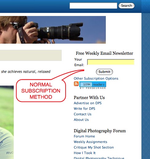
Most bloggers with newsletters put their subscriber form in a sidebar like this:

This is a good and prominent position above the fold and in a place that people notice.
The Pop Over on the other hand is a form that appears, hovering over the content on the page, after a certain predetermined time frame. Here is one of the versions that I’ve been testing:

These Pop Over subscription forms are of course much more intrusive to readers than a sidebar form - this is the reason I resisted using them for so long. My fear was that they’d annoy readers, page views per visit would drop and that I’d end up with a lot of angry emails from readers.
Aweber gives different options to limit how many times these Pop Overs appear on your site - you can show them to every visitor, limit them to show once per visitor or have them show every ‘X’ days. You can also use what they call a ‘lightbox’ which allows you to have the rest of your content fade and for the form to fade in, slide in from above, below or a side etc. I’m testing the Lightbox against the PopOver at present and my early tests are incredibly positive and are increasing subscriber rates even further than pop overs!
So what was the result of my testing?
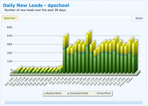
I think this chart of my subscriber numbers says a lot:

I think it is probably pretty obvious when the test started. The last days results are still incomplete but look like being similar to the day before.
Average confirmed subscribers per day have risen to over 350 per day (over a year this would translate to over 125,000) so at least on that front it has been successful.
But what has the reader feedback been?
To this point I’ve had two readers email me to complain about the Pop Overs. One saw them multiple times (I suspect because the cookies associated with them seem to be associated with different versions of the Pop Overs). The other complaint came from an iPhone user who said that the Pop Over took up the whole screen and was impossible to close (something Aweber might want to do some testing on).
Did Reader Engagement or Page Views Suffer?
One of my concerns with Pop overs was that readers would be annoyed by them and surf away from the page. As a result I’ve paid particular attention to the ‘pages viewed per visit’ statistic on Google. Here’s how it looks (click to enlarge):

Pages viewed per visitor has remained stable - in fact if anything they are slightly up since I began the experiment!
Considering page views per visitor didn’t go down and I’m adding 350 or so new potential weekly readers to my blog each day I’d say reader engagement has actually significantly been increasing!
Split Test for Better Results
One of the great things about AWeber is that they’ve built in the ability to split test different versions of subscription forms.
This means that you can design two different forms and have them each show 50% of the time to readers of your blog. Over time it becomes clear that one version out performs another enabling you to then test the best performer with another version of the signup form - making incremental improvements as you go along.
I’ve been testing on two levels:
1. Timing - you can test subscription rates on forms that have a short time before appearing versus forms that have a longer time before appearing. I’ve found that forms that take longer periods of time to appear have a slightly higher signup rate. However these forms show to less people as some navigate away from the page.
2. Copy and Design - the copy and design in your signup form impacts signup rates. I’ve found pictures seem to increase signup rates - also giving benefits and strong calls to action seem to increase signup rates also.
As a guide - I’m seeing signup rates of between 4-5.5%, depending upon the forms. I’m still playing with the split testing though - there is lots to learn!
Final Thoughts
Over all I’m pretty happy that I began to experiment with Pop Over signup forms. On DPS they’ve worked very well and are helping me to make first time readers loyal readers.
I don’t think that they’d work with every blog in the same way. For example to this point I’ve resisted using Pop Over subscription forms here on ProBlogger as I think the audience here will be more annoyed by them than on my photography blog as ProBlogger readers tend to be a bit more skeptical of intrusive marketing.
As always - it’s something to test and track. Pay attention to signals of how readers are receiving it and tread carefully. However don’t rule it out completely too quickly - you could be missing out on a significant way to convert first time readers into loyal ones.
One thing that I think would also be good to experiment with is targeting specific types of readers with Pop Overs. I think specifically targeting search engine visitors with these would make more sense than to target those coming from RSS Readers for example (or at least to be able to present different versions of the pop overs to different readers). Aweber didn’t seem to have plans for doing this themselves but suggested that it would be possible to do with a little coding (I’ll need to work out how).
PS: Tomorrow I’d like to follow up this post with the answer to the most common question that I get when I talk about newsletters - why should a blogger consider starting a newsletter? Stay tuned to my RSS feed for this followup post.


0 comments:
Post a Comment